WELCOME TO THE BRAND SPANKING NEW WEBSITE FOR TIGZ RICE STUDIOS!
(You have no idea how good it feels to say that!)
With so many wonderful opportunities and some new directions at Tigz Rice Studios within the last six months, now felt like the right time time for me to ‘up my game’ with the website. Our previous design had done well to last two years in the fast paced world of digital, but was no longer reflecting the direction the brand was moving in. It was text heavy and didn’t reflect the image rich nature of the brand – the focus of the wonderful new concept.
Originally, my plan had been to hire a professional web developer to do the work for me. With only basic knowledge of the back end of WordPress and very limited knowledge of HTML in the form of a clunky portfolio site I somehow managed to hack together in Dreamweaver back in 2008, I felt creating something that would be up to scratch for a business website was beyond my capabilities. However, fellow Wacom/Adobe colleague Ian Sayers (Giant Training) set me the challenge of taking the website rebrand on myself – and being the stubborn, competitive person I am, of course I accepted that challenge!
How did it go? Well actually it wasn’t as bad as I had imagined it was going to be. With a little help from Ian on alignment issues (and a couple of hair raising frantic emails because I had accidentally no-idea-how-I-did-it deleted the entire public_html folder. Twice… Those of you who code will be face palming right now) it was mostly straightforward. I’m certainly no code writer, but I can edit existing code like a ninja… providing it doesn’t involve aligning anything <center>…
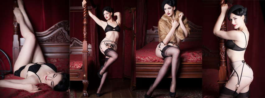
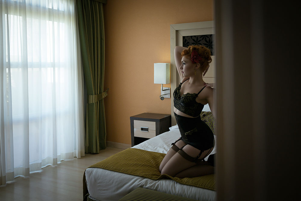
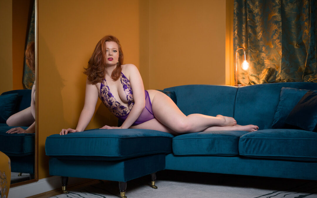
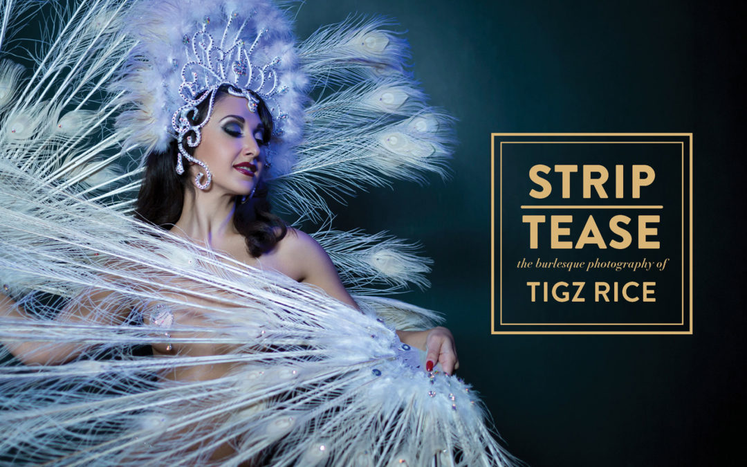
So what’s new? Well, for starters the site now matches the clean monochromatic colours of the branding. The site has waved goodbye to the old faithful maroon flock wallpaper background and instead has a white base, making our blog posts much easier to read. The new theme is tablet and smartphone responsive, so the navigation is far easier for anyone viewing whilst on the move (go check it out on your other devices!). The site is also more image based, highlighting the quality of the work on display rather than hiding it away is galleries or portfolios.
Needless to say, I am really proud of this website and I hope you enjoy exploring it too, including some new work that you won’t have seen before. Feel free to leave comments and start discussions. Finally, an absolutely massive thank you to Ian for being integrally supportive throughout this rebrand and for pushing me out of my comfort zone and showing me that I’m actually not THAT bad at HTML (…famous last words?)
0 Comments